Do PMS Colors Really Matter?
When I work with clients and ask for their PMS colors to match their logo on promotional items, they always ask:
“What’s a PMS color?”
Well, here’s the fascinating definition:
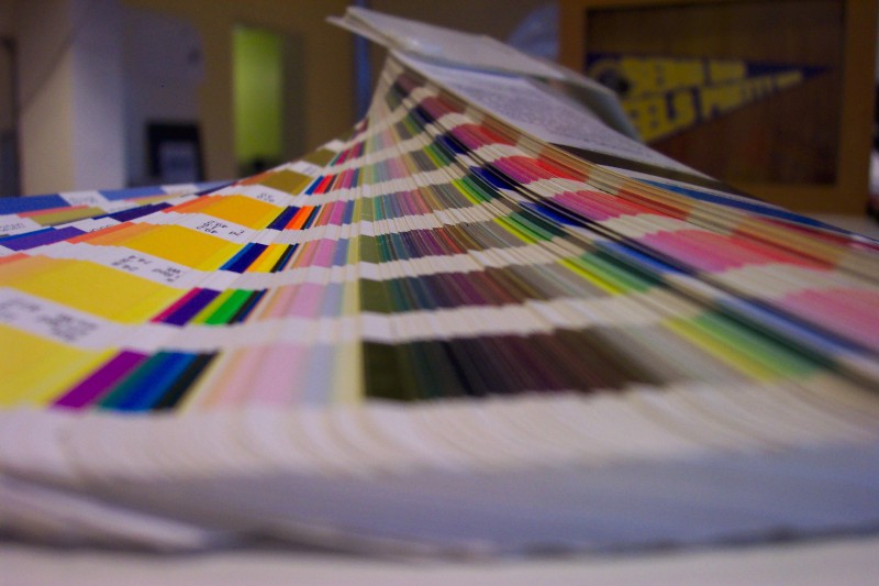
PMS stands for Pantone Matching System (not that other PMS). This PMS is a proprietary color system used in a variety of industries – primarily printing, though sometimes in the manufacturing of colored paint, fabric and plastics.
These PMS colors are a good tool for defining the visual elements of your logo and brand identity. And as you know, the consistency of your brand elements, like your logo, are critical to helping customers and prospects make a visual connection with your brand across different media.
One of the biggest advantages in using specific Pantone or PMS colors is that the color reproduction will be identical every time you print. The system was created in 1963 by Lawrence Herbet to solve the problems associated with producing accurate and consistent colors by creating standardized ink colors and measurements. To give you an example, this is how Cabot cheese can produce the exact red and green in their logo – no matter who produces their material – from business cards to stress balls!
One of my clients wanted to match the red in their logo for bags they were producing. They told me to “just pick a dusty red and match the logo as best as you can.” When I asked what their PMS color was to get an accurate red, the question came up again. “What’s a PMS color and why do I need it”? Once we got the PMS color, their designer was able to provide us with a perfect match for the bags and logo, which were consistent with all of their other material.
The bottom line is always know your PMS colors when starting a print or promotional project so everything is a perfect match! Successful branding is consistency!
If you want to know more about this topic, visit www.pantone.com. There’s a wealth of information on their site!